Monday, May 4, 2015

Rosetacular!

Well, well, what do we have here?


Colored pencil, on paper, in the shape of a rose? A rose drawing? Complete? 100% feline approved??


I've been working on this little beauty for a little over 2 months, and I'm finally done with it. Good riddance! No, it was quite fun, and really turned out much better than I expected.

So I started out with some crummy phone pictures of a rose. Now, I was going to draw the rose while it was, y'know, still alive, but do I get anything done on time? Ha! No.

Rosetacular! Right? Now we move into how exactly you get from a sub-standard photograph to a (hopefully) above-average piece o' art. You already know I ditched the leaves. Why? I dunno, I thought about it. I just wasn't feeling it, I guess! I wanted something simple, I suppose.


A light sketch, and the laying down of a few colors. Feeling it out, hoping everything will look okay in the end. Then a bit more definition, and the addition of the stem. Clearly you can see that I am like "man, I do not want to get into all those layers." Do you know how many petals are smooshed into that rose? Too many, that's the correct answer. I took a slow and steady approach to the whole thing.


Slow and steady can win a race or two, I think. You can see I'm working from the outside in, and shading and defining everything as I go, tweaking everything bit by bit, petal by petal. At this stage you can see I'm mixing in more colors. And yes, I did use about 25 colored pencils for this project, with probably 10 of them getting the most use.


Clearly, there's only so long that the inner rose petals can be avoided.

Then, of course, things start to get tedious. And confusing. I try to define the shape and placement of each petal, but then there's the layers of colors to add, to make the shading, to make everything more rich and (hopefully!) more wonderful.

On the picture below, you can see that I'm going into the final stretch: all the petals are there, everything has color, and now it's just a matter of buildup, filling in the gaps and defining the details.


Once that's done? Oh, sweet victory-


It kinda looks like a rose, yay! It's all I ever wanted. Quite the journey, my friends. Are we all richer for the experience? I know I am.


Thursday, April 16, 2015

Works in progress: snakes and stuff

I woke up one day and felt like painting a snake. Luckily this is a dream I'm quite capable of fufilling, so I jumped right into it:


This is a terrible picture full of glare (it's glarrible!), but it gives you an idea. I wanted something up close and personal, sweet colors, a snake that's fierce, beautiful, captivating.


 You can see here that the snake begins to grow up, gets more definition, less of a shadow and more of a living thing.


After coating the snake with another layer of paint, I start adding scales.

This was really quite tedious.


But really quite worth it, I think.

I got a little frustrated trying to change the eye around, messing with different colors and things, so it lost a little bit of its luster as more scales were added. I'll get back to it. The scales, now that they're all more or less in there, will now of course need to be refined. And I don't know what'll be happenning in the background. Or what color the snake's eye, or even the snake itself, will end up being.

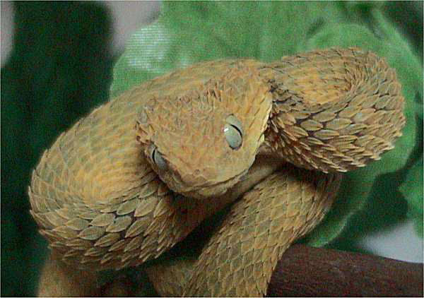
I based the snake's look on Atheris squamigera, a bush viper.

Photo from wikipedia. More here!

I knew I wanted to paint a viper of some sort (..I just like vipers?), and a search of viper species led me to squamigera, an exceedingly beautiful and captivating snake.

Next in line:


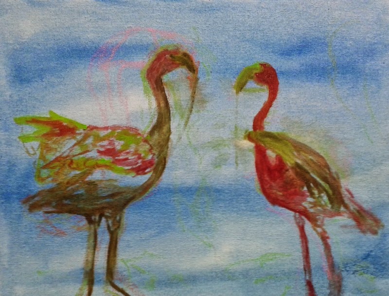
Flamingos! This is a considerably smaller painting, and it's not nearly as far along as its snakey roommate. Right now it's really no more than a rough sketch. We'll see what happens to it in a few weeks!

Next up is a really fun project: tape art!


The assignment: recreate a classic masterpiece of art, using a myriad of decorative and practical tape. I chose to work from this piece by Joan MirĂ³. It called to me. So lively! So weird! So much detail! And cool shapes.


You can see I chose to zoom in to the little bug fellow. At first I was a little baffled by how on earth to work in tape, and thought, "goodness gracious, this is going to be tedious and insane." And yeah, it is kinda tedious (and maybe kinda insane), but as I got used to it, it became really fun, and really satisfying, too. Multiple rolls of tape, cutting, cutting, and more cutting, sticking and resticking, hands full of tape and scissors and multiple funky little pieces. There's almost a sort of rhythm to it.

I'm enjoying it way more than I thought I would at the beginning, and I love the subject I chose. This painting is really fun to explore, and recreate in my own way. And the tape itself is so charming.

Finally, we've got some colored pencil work:


If you give a rose to an artist, you can almost guarantee the artist is going to draw it, right? Isn't that some law of nature? Wouldn't nine out of ten artists agree? I dunno, but if you give me a rose, I'm gonna draw it, that you can say for sure. The color's so rich and vivid, the sentiment's so sweet, and if you stare at it for a week or so, well, how can you resist?


I hadn't worked in colored pencils in a long time! I felt rusty. They seem like they should be very simple, but I don't think they are. Lots and lots of layers, slow and steady work, building up the color and the form.


I think it's coming along really nicely. If I do so say so myself. Don't know what I'm going to do with the background yet, if anything. I do have a lot of colored pencils, so its nice to put them to use after they sat around for a while (I mean - vacationed for a while, in colored pencil land!). Good to remember the fun stuff they're capable of.

It's very motivational to look back and see how artworks have progressed!

Wednesday, April 8, 2015

Baytown Nature Center tunnel book

What's this? A bird?


And what's this - another bird?


Even more birds?


Of course!


Because this is the Baytown Nature Center, one of my favorite places, mostly because it has a lot of birds! I love the place so much, I made a whimsical little tunnel book to represent and express my love for it. I just couldn't help myself. My hand slipped - and I drew a bunch of birds. Slowly and steadily they grew their way into some sort of multidimensional watercolor painting.


I will confess right away that I enjoyed this immensely. Creating it was tons of fun. Few things are quite so magical and soothing as converting memory and emotion into what feels like a living, breathing work of art. Something you can show your friends and family, something that people can talk about and discuss, something that can sit on your own shelf, reminding you of good things that have made you happy and felt enormously special to you. A fantastic sort of bridge between the physically tangible and the purely emotional, constructed at last! Feels real good. And sometimes you don't know how much something means to you until you pick up a pencil, and suddenly all the feelings come gushing out onto the page and you're left thinking, "Huh, I guess I really care about this!"


Do I care whether other people pick up on that emotion or not, when they look at the piece? Do I care if they get a sense of the memories, of what I see when I visit that nature center? I dunno, I guess so. But that's a secondary concern. It's something I might hope for, I suppose! But it's not my primary goal in the creation of the piece. My goal, I guess, was only: "I want to capture and display aspects of this place that I love, shaped by my own vision, twisted by my own senses, my own heart, in a way that is mine and mine alone." Photographs are pieces and fragments, vivid stills; this is more a love letter or an essay.


Because my goal was mainly to explore my own memories of the place, I decided from the get-go not to be painstakingly realistic, to go more with what memory and imagination said than what photographs might tell you. The flowers, for example, are ridiculous and totally made up, but there are a lot of really cool plants there at the real world nature center, plenty of flowers, plently of grubby water plants and cacti and twisting vines and little trees with completely green skin, and those flowers are a bizarre representation of all that. Something that could exist there, maybe, but doesn't; not quite.

The frog, of course, is exaggerated, as is the crab, and the birds are drawn from memory as well, but my memory for birds is a little more detailed, so they're all specific species, and they're all common and you can see all of them there and at many other places as well. The moderately majestic Great Blue Heron, at the front; the funky White Ibis; the tiny and talented Belted Kingfisher; and the eagle in the back with the fish, that's supposed to be an Osprey.

It's not particularly recognizable as an Osprey, mostly because I realized too late that I'd put two white birds awfully close to one another, and having both the Osprey and the ibis be bright white was going to mess up my composition. Not knowing what else could possibly work, I just went with orangey-brown, thinking, "hmmm, well, maybe it could be a Golden Eagle, too..." even though I've never seen one. Or maybe a young Bald Eagle - something I have seen there? Do they catch fish like that, too? Hm, things I don't know. Anyway, the point is I didn't really know what an Osprey looked like anyway, and fuzzy memories and throwing random birds in random places makes for weird fusion birds that exist only in watercolor paintings.


I should probably mention the background: it features refineries and the Fred Hartman bridge, which you can, of course, see from many places in the nature center. A painting meant to represent my feelings and memories of the place absolutely wouldn't be complete without them. They're a major identifier of the location, and something you can't help but notice when you're there. I would've included a big ship going by as well, but I only had so much space, and the birds were definitely more important.

Some people viewing the piece thought I was making a statement about industry/humanity encroaching on nature, and yeah, I guess you could see it that way, as habitat destruction is all too real and all too widespread. But I was really just trying to describe the place as I saw it. You go there: this is what you see. That's as far as my intention goes.

I personally delight in the contrast, an island of vibrant wildlife surrounded by refineries, neighborhoods, other signs of industry and humanity. You can see the San Jacinto Monument; you can see the Fred Hartman bridge; the ship channel, oil refineries; playgrounds for kids, and people's houses, docks, and recreational boats. To me, the place feels like a sanctuary: not something that's being encroached upon, but one little piece of nature, saved, because the habitat had already been destroyed (the place used to be a neighborhood - when it flooded, it converted to wet lands, wildlife habitat, a park for fishing and birding).

I see it and say yes, the refineries are here, and thank goodness these birds are here, too. Thank goodness these two things can exist in the same picture. It's a sense of relief, more than a sense of peril. I'm thankful and glad, because this little piece of nature - and it does so feel like such a little piece, surrounded by industry as it so visibly is - feels like a little piece of paradise.

Anyway, enough about that! Here's my initial draft sketch:


Little note, actually: though I told you everything was drawn from memory, my memories of what the refineries and the bridge actually looked like were so abysmal (because they're not alive at all, gosh!), that I actually did make a special trip out to the nature center to sketch them. Just a little bit. So that I felt like I could draw something that looked kinda like them. Strengthen those memories, a little! It did help, to sketch for a little while, sit for a while and really have to look at them, and think about their identifying details, and how they work. Because everyone knows I'm looking at the birds when I'm out there, and all those refineries, big ships, even the cool bridge - it all gets only a passing glance.


 A funny thing that happened when I moved to sketching on the watercolor paper, is I drew everything much larger than I did on my draft sketch. This was not intentional at all; I didn't even realize I was doing it. It got so bad, and was so hard for me to correct (I don't know why), that I had to redraw my "Osprey" multiple times, and eventually had to cut out my original drawing to use as a size reference.


As you can see, the "book" was assembled layer by layer, each layer cut and painted separately. I did rough sketches so everything ended up in the right place and looked ok; then painted in watercolor; then outlined those watercolor images in Sharpie marker. Thin Sharpies are my favorite thing, y'all. The outlining was my favorite part.


What I considered a moment of true victory was one of my teachers saying she recognized the bridge, the moment she saw it, and so recognized the entire area. Another was when a different teacher said she could name each of those birds. I remain very glad that I managed to create a recognizable location, and recognizable animal life! I enjoy that.

"Hey, look at all this nature! It exists, and I've found it well worth exploring. There are things to see here, and stories to tell." That's what this painting wants to say, in my very, very humble opinion.

BONUS POINTS! These are wonderfully imaginative and fantastic tunnel books that some of the kids in my class made!


I love these so much. I was tempted to buy all of them, I wanted to look at them all day long. It's such a fun project, and everyone has a different take on it! It was really cool to see the different things that inspired people.

And if you want to see more nature center, maybe to compare with the book, or maybe because you missed the photo post, you can click here to see some photos I took there once upon a time!

Monday, December 22, 2014

Figure drawings, 2013 to 2014

We draw live models, sometimes, in class. These are some of my gesture drawings from 2013:


Not particularly impressive! Very tentative. Reminder: gesture drawings are quick drawings anywhere from 30 seconds to five minutes, a good way to warmup before more detailed drawings.

Now here are some gesture drawings from 2014:


This was really fun: our model was a dancer, and I enjoyed trying to capture the
movement of the dance poses. The time limit of only a few minutes actually made this way more fun - and easier, in a strange way - than if I'd had all the time in the world to draw them.

A little bit better, right? I think so.
What changed? Confidence, and practice throughout the year (those two things being somewhat correlated). In the first set of drawings, I had no idea how I wanted to go about drawing a human being. And I learned a great deal, in the following year, about what makes a good drawing. So when I approached figure drawing this year, I had a much better idea of what I wanted my drawings to be, and how to make them happen.

From casual practice and study, I figured out what I liked about drawing people, and what I wanted to focus on (emotions, lines, personality, form). I also figured out what I didn't know, the areas in which I could use more practice and study to better achieve what I wanted (certain aspects of people in profile, wider variety of movement, details of clothing, hand gestures, this list goes on forever). With some increase in drawing technique, I learned how I could make my drawings a bit more interesting (hello line variances, stronger contrasts, etc.), which lead to me feeling more engaged with my drawings and a bit more confident in my abilities. All of this led to me feeling pretty determined and eager when I approached figure drawing again.

Artistic progression: some sort of weird alchemy of time, action, knowledge, and motivation. Or so it seems, sometimes. I don't know. Feedback, observation and instruction from others has been essential, but so have those hours drawing alone at 12:30am and not worrying about any of those things.

Those stick figure drawings may not look very impressive, but I know they were an important stepping stone. I remember looking at my stick figures, and then looking at the gesture drawings of my much more experienced classmate. Hers were vibrant and detailed, full of body, full of life. I remember thinking "Wow, these can be beautiful. I have so much to learn here. I could re-imagine my entire approach to this."

Let's check out a portrait, from the same time period as those stick figures:

All black and white drawings in this post were done with charcoal, on sketch paper.

I think it's clear from this drawing that I felt much more comfortable drawing faces than drawing full figures. While many of my classmates were dismayed at having to do a portrait, I was excited! I love faces. I think they're always interesting to draw. Though my lack of experience still shows, I was very engaged with the subject, and I hope that shows, too.

Here's a portrait from later in the year:


We had a bowl of fruit and a model available, and I focused a little more on the bowl of fruit; I think because I felt a little stuck drawing the model! The fruit seemed easier. The model was knitting, which is impossible to tell from the drawing, but explains why her eyes appear closed and her hand looks a little strange. I do like the pineapple a lot!

Another drawing, this time in pastels, with the same model:


Again, I decided to make fruit the focus! I guess I liked her boots? Felt like drawing feet? I don't remember why I wanted to go this route. It does tend to be easier to focus in on one thing. And it is true that when it comes to drawing figures, I tend to neglect the feet! I think this was about the time I started to notice that, and try to correct it. So the boot makes sense: I was interested in learning how to draw shoes at the time.

Back to 2014:


More gesture drawing.


Introduction of a second model, and trying to capture a height difference.


I don't like this one all that much, but it got high praise in class! Another dance pose, with one model holding up the other, but I was at a tricky angle and picked the composition I felt was my best option: zooming in on the face and hand. It was still tricky.

Some pastel drawings:


I chose absurdly bright colors, because that's what I enjoy. I felt like I was just starting to get used to the charcoal, so I found the switch to pastels a little disorienting! But the colors are always kinda fun to work with.

I still have a lot to learn when it comes to drawing, but it's an enjoyable journey.

Saturday, November 29, 2014

cats and birds all across the sky

Some of you may remember that commission I was working on! It's finally finished! And safe and happy in its new home. It's up on the website right here, where it shall be preserved for all eternity.

I've also been struck by a fit of the crazies, and decided to go back and do some small edits on a painting that's been "finished" for over a year. For all that time, I let it be, even though there was significant work that could be done to it, because I didn't feel motivated enough and no one else seemed to care that it was - technically, in my view at least - unfinished.
I must simply cross my fingers and hope that everyone agrees with me, and thinks the new one is better.

I just simply couldn't stand that the birds didn't have ANY FEET, and my goodness gracious just, just -- look at that old branch.


This was all I saw when I looked at that painting and I didn't like what I saw. Everything in me screamed that it wasn't right. I didn't care that my family was all "hey, it's cool". It gnawed on me like a persistent beaver. One day I just cracked, I thought "I can't live with this anymore, I can't live my life knowing I just left it like this" and I did something I never normally do, which is go back to a piece a year later and change it.

Isn't this better? So much more solid? And it makes some semblance of sense, too? Some still say it makes no difference, but I can live with this. So I'm happy.

They were always supposed to have feet. I just never put the feet on there. Now I have, and all is right with the world. Here are some extra pictures to celebrate:


Aaaand, here's a bonus picture! It's the next painting I'll be working on: