Showing posts with label my art. Show all posts

Friday, July 24, 2015

Animal Gesture Drawings : July 23rd 2015

A major goal of mine is to squash any resistances I have toward drawing. Sometimes, I want to draw, but I'm reluctant to actually do it, because...drawing is hard? I'm allergic to emotion? I'll explode under all the self-inflicted pressure?? I will begin to feel that life is inevitably futile and sad??? Sure, sure, that all may be (just slightly) exaggerated, but - whatever the reasoning - sometimes I do avoid drawing, even when it feels like something I ought to do.

But in order to achieve some greater ambitions, such as drawing wildlife in the field that will never, ever stand still for you, being much better at drawing is a requirement. Speaking of wildlife again, drawing not just quickly, but precisely, would be my lofty goal.

I would like drawing to feel as natural and unimpeded as possible. I think if it ever truly feels easy I might feel like I'm doing something wrong. But natural, quick, sharp, automatic, with less doubt, less "I'm not sure what I'm doing; this is a jumbled mess I can't make sense of; I hate this drawing and everything it stands for", would indeed be nice.

Top left two: 30 second sketches (peahen, kiwi). Right side four: 1 minute sketches (macaw, sparrow, dove, duckling). Bottom left: 10 minute macaw.  Sort-of center: 5 minutes each for goose and seagull.
That's where gesture drawing comes in! Practice, practice, practice. Quick sketches, always with a set timer, and hopefully I'll get into the habit of doing these more often than just once every blue moon, because it's an important exercise for me. Building comfort with drawing, more confidence with skill, and more familiarity with anatomy, form, shape, shading, style. Trying to build myself a little no-pressure free-draw zone while still saying "Hey. Get good."

More 30 second birds surrounding a 5 minute horse, 5 minute squirrel, and 10 minute kangaroo. Yes the kangaroo was in a weird as heck position with strange perspective. It was not trying to be handsome or sensible like the other animals.
Helping a lot to make this practice easy is a neat figure and gesture drawing tool completely free on the internet: http://artists.pixelovely.com/. I love that they have animal drawing among the choices, and that you can customize the kinds of animals you want, focusing on birds, mammals, or anything from bunnies to tarantulas. I enjoy doing the "class style" program with a variance of sketch times.

Having a timer really helps cut back on the existential despair. Although there's still a lot of internal screaming and frustration words on those thirty second drawings, that's just part of the thrill. The joy of art, I should say.

My 30 second and 1 minute mammal sketches are not pictured here, because most are nigh-indiscernible and my brother made fun of them. Good exercises, not always pretty to look at it, not always something I'm gonna want to see again in ten years.

My brother did not make fun of this parrot, the way he made fun of the poor squiggle cats.
There's an awful lot of mental calculation that goes into drawing and it's only consistent practice over time that's going to improve that. You have to learn how to look, and what to look for, to construct your drawing, and how to do all the proper proportion checking and re-checking that will eventually become automatic. I still have to catch myself when I automatically draw a wing at the wrong angle, and that's just one example.

Five minutes was not enough time to draw that entire horse and all its legs. Not with my limited familiarity with entire horse and weird flailing leg anatomy.
Given that my ultimate goal is to draw things that move, well enough that I can capture things like personality, detailed body language, accurate identifiers, and behavior, the more automatic all the basic processes can be, the better. I want no hesitancy when it comes to putting pencil to paper.

Sunday, June 7, 2015

Styrofoam Sculpture


So, once upon a time, in a funky little art class, I made myself a gigantic styrofoam cat.

And when I say giant, I really do mean it, because here it is next to a regular cat and an average adult human's chair:

It's 4 foot, 3 inch tall cat!
I always decide to be a little ambitious. Most of the sculptures were not quite so tall (and they were still lovely!), but I've been doing this "art" thing for a while now, so I feel like I need to push the edges sometimes. Could I have made a much smaller cat? Yes. Would that have been a lot easier? Yes. Why did I want to make a cat sculpture that is larger than most children? Maybe to hear said children pointing it out with awe and wonder. That's definitely pretty rewarding.

Painting it took forever. That's what always happens with sculptures like this. The building is one thing, the painting is a whole 'nother ball game and usually takes twice as long and always takes more time and more effort than I think it will. You'd think I'd have learned that by now. It's the painting, not the building, that caused me to work overtime on this thing.

This thing was assembled from sheets of styrofoam, glue, and toothpicks. It's that easy. Some pliers to snip off the ends of the toothpicks, a little saw to cut and carve the styrofoam. The paint is just regular acrylics. It is worth noting that during the carving process styrofoam dust gets everywhere and requires a lot of vacuuming to clean up.


I don't really have a great place to put this thing. It's in my studio right now, keeping watch over my stuff, but that's not the most glorious place for it. And I don't know who would want a giant styrofoam cat, but this thing is totally for sale. So if you know anyone who wants a strange giant cat, hey, I've got one.

Just sayin'.

Anyway, here are some extra, unrelated photos!


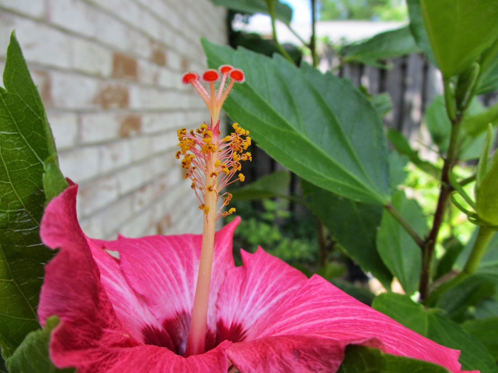
I don't know anything about plants, but these fuzzy antenna things going on with the hibiscus flowers are pretty dang cool.

Wednesday, May 13, 2015

Ring-necked Parakeets in watercolor

Step 1: sketchy-sketch.


Step 2: some vaguely parrot-shaped blobs of color.


Step 3: those parrots need some beaks and feet!


Step 4: and they need something to stand on, too, don't they?


Step 5: how about some lovely parrot eyes? And other important facial features, such as visible mouths and neck markings?


Step 6: What about details? Better wings, better feathers! The parrots demand them! Also more of a background, too!


Step 7: Ah, but we need more of a background than that! Something that seems a little more interesting, and a little less flat. And just a little bit more polish on those parrots so they stand out, the stars of the show.


That's it, that's the end! It's like magic. Parrots, suddenly, where there were no parrots before! Watercolor paints on watercolor paper, with some colored pencil work for the details, and a tiny bit of black ink for those parrot pupils.

My workspace
Why Ring-necked Parakeets? I kinda fell in love with them when I watched some really charming individual pet birds on YouTube. I was fascinated by how many of them seemed to really love stuffed animals - my parrot, a Blue-crowned Conure, has only ever had a very passing interest in them (she might bite them, or give them one kiss or a high-five if prompted, but that's it). They also have such sweet voices!


You can see from the videos that the captive birds come in a variety of colors, and you might be able to tell from the painting that I'm pretty fond of that pastel blue form.Wild birds are usually green, though you can see from photos like this that the green can include aspects of blue:

Photo from Wikipedia

Parrots and Squirrels feeding together
Photo from Flickr
               
So, in short, I just think they're really charming, interesting, charismatic birds, which is why I wanted to paint some.


Monday, May 4, 2015

Rosetacular!

Well, well, what do we have here?


Colored pencil, on paper, in the shape of a rose? A rose drawing? Complete? 100% feline approved??


I've been working on this little beauty for a little over 2 months, and I'm finally done with it. Good riddance! No, it was quite fun, and really turned out much better than I expected.

So I started out with some crummy phone pictures of a rose. Now, I was going to draw the rose while it was, y'know, still alive, but do I get anything done on time? Ha! No.

Rosetacular! Right? Now we move into how exactly you get from a sub-standard photograph to a (hopefully) above-average piece o' art. You already know I ditched the leaves. Why? I dunno, I thought about it. I just wasn't feeling it, I guess! I wanted something simple, I suppose.


A light sketch, and the laying down of a few colors. Feeling it out, hoping everything will look okay in the end. Then a bit more definition, and the addition of the stem. Clearly you can see that I am like "man, I do not want to get into all those layers." Do you know how many petals are smooshed into that rose? Too many, that's the correct answer. I took a slow and steady approach to the whole thing.


Slow and steady can win a race or two, I think. You can see I'm working from the outside in, and shading and defining everything as I go, tweaking everything bit by bit, petal by petal. At this stage you can see I'm mixing in more colors. And yes, I did use about 25 colored pencils for this project, with probably 10 of them getting the most use.


Clearly, there's only so long that the inner rose petals can be avoided.

Then, of course, things start to get tedious. And confusing. I try to define the shape and placement of each petal, but then there's the layers of colors to add, to make the shading, to make everything more rich and (hopefully!) more wonderful.

On the picture below, you can see that I'm going into the final stretch: all the petals are there, everything has color, and now it's just a matter of buildup, filling in the gaps and defining the details.


Once that's done? Oh, sweet victory-


It kinda looks like a rose, yay! It's all I ever wanted. Quite the journey, my friends. Are we all richer for the experience? I know I am.


Thursday, April 16, 2015

Works in progress: snakes and stuff

I woke up one day and felt like painting a snake. Luckily this is a dream I'm quite capable of fufilling, so I jumped right into it:


This is a terrible picture full of glare (it's glarrible!), but it gives you an idea. I wanted something up close and personal, sweet colors, a snake that's fierce, beautiful, captivating.


 You can see here that the snake begins to grow up, gets more definition, less of a shadow and more of a living thing.


After coating the snake with another layer of paint, I start adding scales.

This was really quite tedious.


But really quite worth it, I think.

I got a little frustrated trying to change the eye around, messing with different colors and things, so it lost a little bit of its luster as more scales were added. I'll get back to it. The scales, now that they're all more or less in there, will now of course need to be refined. And I don't know what'll be happenning in the background. Or what color the snake's eye, or even the snake itself, will end up being.

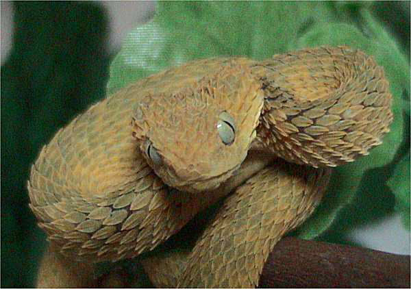
I based the snake's look on Atheris squamigera, a bush viper.

Photo from wikipedia. More here!

I knew I wanted to paint a viper of some sort (..I just like vipers?), and a search of viper species led me to squamigera, an exceedingly beautiful and captivating snake.

Next in line:


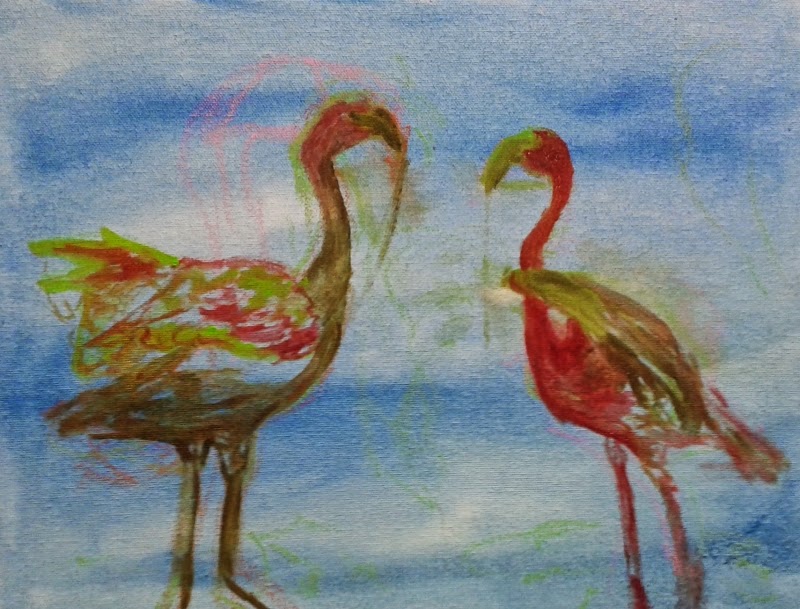
Flamingos! This is a considerably smaller painting, and it's not nearly as far along as its snakey roommate. Right now it's really no more than a rough sketch. We'll see what happens to it in a few weeks!

Next up is a really fun project: tape art!


The assignment: recreate a classic masterpiece of art, using a myriad of decorative and practical tape. I chose to work from this piece by Joan MirĂ³. It called to me. So lively! So weird! So much detail! And cool shapes.


You can see I chose to zoom in to the little bug fellow. At first I was a little baffled by how on earth to work in tape, and thought, "goodness gracious, this is going to be tedious and insane." And yeah, it is kinda tedious (and maybe kinda insane), but as I got used to it, it became really fun, and really satisfying, too. Multiple rolls of tape, cutting, cutting, and more cutting, sticking and resticking, hands full of tape and scissors and multiple funky little pieces. There's almost a sort of rhythm to it.

I'm enjoying it way more than I thought I would at the beginning, and I love the subject I chose. This painting is really fun to explore, and recreate in my own way. And the tape itself is so charming.

Finally, we've got some colored pencil work:


If you give a rose to an artist, you can almost guarantee the artist is going to draw it, right? Isn't that some law of nature? Wouldn't nine out of ten artists agree? I dunno, but if you give me a rose, I'm gonna draw it, that you can say for sure. The color's so rich and vivid, the sentiment's so sweet, and if you stare at it for a week or so, well, how can you resist?


I hadn't worked in colored pencils in a long time! I felt rusty. They seem like they should be very simple, but I don't think they are. Lots and lots of layers, slow and steady work, building up the color and the form.


I think it's coming along really nicely. If I do so say so myself. Don't know what I'm going to do with the background yet, if anything. I do have a lot of colored pencils, so its nice to put them to use after they sat around for a while (I mean - vacationed for a while, in colored pencil land!). Good to remember the fun stuff they're capable of.

It's very motivational to look back and see how artworks have progressed!

Wednesday, April 8, 2015

Baytown Nature Center tunnel book

What's this? A bird?


And what's this - another bird?


Even more birds?


Of course!


Because this is the Baytown Nature Center, one of my favorite places, mostly because it has a lot of birds! I love the place so much, I made a whimsical little tunnel book to represent and express my love for it. I just couldn't help myself. My hand slipped - and I drew a bunch of birds. Slowly and steadily they grew their way into some sort of multidimensional watercolor painting.


I will confess right away that I enjoyed this immensely. Creating it was tons of fun. Few things are quite so magical and soothing as converting memory and emotion into what feels like a living, breathing work of art. Something you can show your friends and family, something that people can talk about and discuss, something that can sit on your own shelf, reminding you of good things that have made you happy and felt enormously special to you. A fantastic sort of bridge between the physically tangible and the purely emotional, constructed at last! Feels real good. And sometimes you don't know how much something means to you until you pick up a pencil, and suddenly all the feelings come gushing out onto the page and you're left thinking, "Huh, I guess I really care about this!"


Do I care whether other people pick up on that emotion or not, when they look at the piece? Do I care if they get a sense of the memories, of what I see when I visit that nature center? I dunno, I guess so. But that's a secondary concern. It's something I might hope for, I suppose! But it's not my primary goal in the creation of the piece. My goal, I guess, was only: "I want to capture and display aspects of this place that I love, shaped by my own vision, twisted by my own senses, my own heart, in a way that is mine and mine alone." Photographs are pieces and fragments, vivid stills; this is more a love letter or an essay.

Because my goal was mainly to explore my own memories of the place, I decided from the get-go not to be painstakingly realistic, to go more with what memory and imagination said than what photographs might tell you. The flowers, for example, are ridiculous and totally made up, but there are a lot of really cool plants there at the real world nature center, plenty of flowers, plently of grubby water plants and cacti and twisting vines and little trees with completely green skin, and those flowers are a bizarre representation of all that. Something that could exist there, maybe, but doesn't; not quite.

The frog, of course, is exaggerated, as is the crab, and the birds are drawn from memory as well, but my memory for birds is a little more detailed, so they're all specific species, and they're all common and you can see all of them there and at many other places as well. The moderately majestic Great Blue Heron, at the front; the funky White Ibis; the tiny and talented Belted Kingfisher; and the eagle in the back with the fish, that's supposed to be an Osprey.

It's not particularly recognizable as an Osprey, mostly because I realized too late that I'd put two white birds awfully close to one another, and having both the Osprey and the ibis be bright white was going to mess up my composition. Not knowing what else could possibly work, I just went with orangey-brown, thinking, "hmmm, well, maybe it could be a Golden Eagle, too..." even though I've never seen one. Or maybe a young Bald Eagle - something I have seen there? Do they catch fish like that, too? Hm, things I don't know. Anyway, the point is I didn't really know what an Osprey looked like anyway, and fuzzy memories and throwing random birds in random places makes for weird fusion birds that exist only in watercolor paintings.


I should probably mention the background: it features refineries and the Fred Hartman bridge, which you can, of course, see from many places in the nature center. A painting meant to represent my feelings and memories of the place absolutely wouldn't be complete without them. They're a major identifier of the location, and something you can't help but notice when you're there. I would've included a big ship going by as well, but I only had so much space, and the birds were definitely more important.

Some people viewing the piece thought I was making a statement about industry/humanity encroaching on nature, and yeah, I guess you could see it that way, as habitat destruction is all too real and all too widespread. But I was really just trying to describe the place as I saw it. You go there: this is what you see. That's as far as my intention goes.

I personally delight in the contrast, an island of vibrant wildlife surrounded by refineries, neighborhoods, other signs of industry and humanity. You can see the San Jacinto Monument; you can see the Fred Hartman bridge; the ship channel, oil refineries; playgrounds for kids, and people's houses, docks, and recreational boats. To me, the place feels like a sanctuary: not something that's being encroached upon, but one little piece of nature, saved, because the habitat had already been destroyed (the place used to be a neighborhood - when it flooded, it converted to wet lands, wildlife habitat, a park for fishing and birding).

I see it and say yes, the refineries are here, and thank goodness these birds are here, too. Thank goodness these two things can exist in the same picture. It's a sense of relief, more than a sense of peril. I'm thankful and glad, because this little piece of nature - and it does so feel like such a little piece, surrounded by industry as it so visibly is - feels like a little piece of paradise.

Anyway, enough about that! Here's my initial draft sketch:


Little note, actually: though I told you everything was drawn from memory, my memories of what the refineries and the bridge actually looked like were so abysmal (because they're not alive at all, gosh!), that I actually did make a special trip out to the nature center to sketch them. Just a little bit. So that I felt like I could draw something that looked kinda like them. Strengthen those memories, a little! It did help, to sketch for a little while, sit for a while and really have to look at them, and think about their identifying details, and how they work. Because everyone knows I'm looking at the birds when I'm out there, and all those refineries, big ships, even the cool bridge - it all gets only a passing glance.


 A funny thing that happened when I moved to sketching on the watercolor paper, is I drew everything much larger than I did on my draft sketch. This was not intentional at all; I didn't even realize I was doing it. It got so bad, and was so hard for me to correct (I don't know why), that I had to redraw my "Osprey" multiple times, and eventually had to cut out my original drawing to use as a size reference.


As you can see, the "book" was assembled layer by layer, each layer cut and painted separately. I did rough sketches so everything ended up in the right place and looked ok; then painted in watercolor; then outlined those watercolor images in Sharpie marker. Thin Sharpies are my favorite thing, y'all. The outlining was my favorite part.


What I considered a moment of true victory was one of my teachers saying she recognized the bridge, the moment she saw it, and so recognized the entire area. Another was when a different teacher said she could name each of those birds. I remain very glad that I managed to create a recognizable location, and recognizable animal life! I enjoy that.

"Hey, look at all this nature! It exists, and I've found it well worth exploring. There are things to see here, and stories to tell." That's what this painting wants to say, in my very, very humble opinion.

BONUS POINTS! These are wonderfully imaginative and fantastic tunnel books that some of the kids in my class made!


I love these so much. I was tempted to buy all of them, I wanted to look at them all day long. It's such a fun project, and everyone has a different take on it! It was really cool to see the different things that inspired people.

And if you want to see more nature center, maybe to compare with the book, or maybe because you missed the photo post, you can click here to see some photos I took there once upon a time!